Experimental Animation
Over the summer I intend to produce an experimental animated film based on a subject I feel passionate about. Whatever subject I feel passionate enough to choose will be expressed or even implied through the use of stylised visuals.
Tim 'A is for Autism' is unique in that it uses the style that children draw with colouring pencils/pens to bring images that bring childhood autism to life. The main feature of this film is the use of stick or simplified figures and trains, usually the more modern electric/diesel engines travelling across rails that are drawn out of thin air. Railways and trains tend to be a source of fascination for many in their childhood because of its magnetic pull, so Tim Webb reaches out to those of autism with themes that evoke childlike thought process.
In an earlier part, drawings of human profiles shift from one likeness to another in styles ranging from crude childlike scribbles to realistic portraits, or even distinctive styles not uncommon to cartoonists. Furthermore, geometric drawings of houses, railway signalling and window bars show us well-coordinated framing within the space afforded by the camera. Apparently Webb got both autistic children and adults to illustrate for his animated film, which shows us the struggle these people have made in coming to terms with their mental conditions.
Over the montage, individuals describe their autistic thoughts and feelings. These people suffering from autism sound afraid, emotional about explaining their personal experiences with autism. This reluctance seems to suit the somewhat psychedelic visual, if quirky, effects.
In between animated sequences, a girl no older than 5 is shown drawing, a coin is dropped on a table surface and a record disc spins. Despite the difficulty caused by autism, the child enjoys drawing. Furthermore, as a woman tells of how “being hugged was like being swallowed by a tidal wave,” the hand-drawn paper cutout of a girl lies in the arms of a kindly, motherly woman in an armchair. In a time lapse, Webb makes this cutout disappear in the arms of the mother completely. Cuddling for someone with autism must feel like the whole world is falling in on them. Through this combination of live action and stop-frame, we can sympathise with the woman narrating her autistic experience.
Another trick Webb uses to underline the perspective of someone suffering from autism is when the woman from before describes what it was like trying to hear. With the close-up of a blond woman speaking, sounds are amplified from all around the room she is standing in. This cuts to an animated diesel train screeching loudly along tracks just before the woman narrating say that trying to hear speech sounds like the rush of something oncoming. By overlaying narration with visual and audio effects, Webb underlines the difficulty autistic people must feel through sight and hearing.
‘A for Autism’ offers us fresh insight into the troubled lives of people with mental disabilities through his kaleidoscopic visuals. We can gain substantial understanding of autistic people while feeling encouraged by their show of artistic flair that contributed to Webb’s animated documentary.

Agnes Varda
Agnes Varda’s filmmaking opens our eyes to the possibilities visual media affords us all as animators and filmmakers. As a documentary filmmaker, she uses chance, not unlike musician John Cage, as her “best assistant.” (McLaughlin, K. 2018)
Part of Varda’s visual tapestry includes juxtaposition and contrast, such as an elderly man and woman sitting in the garden with their backs to the screen, then an attractive girl in a richly-coloured gown briefly flirting with a strapping young man in a jacket. Varda has the elderly couple looking sedentary whereas the young couple pace around each other briefly until the girl walks on past the man. She must be skirting his attention to play with his affections or showing him who has power here.
Similarly a French young woman in a white dress breaks down into tears when she finishes singing, which prompts a middle-aged assistant to step onstage and comfort her. Compared to this, a young woman raves in front of a bearded man (who possibly owns the caravan in the shot) about how she hates being a secretary so she left her “jumped up bosses” and criticises the man as a boss “on the road.” The caravan man harshly replies she has “been reading too much trash.” Their relationship seems to be an outright sour one.
By filming against the backdrop of French society and juxtaposing men and women, including their strengths and their vulnerabilities, Varda presents to us a look into the dynamics of both genders.
One trick in Varda’s arsenal includes close-ups of those she films. A man and woman are lying together looking contemplative, possibly about their relationship. We are also shown two pairs of hands propped on a table, the left clearly those of an older woman and the right being a girl’s. The girl’s hands are first to shift position whilst the mother’s stay where they are. The first one to move indicates the tension and anxiety she feels under pressure from whatever subject she and the adult are discussing. Close-ups of physical interaction can underline the passion felt between lovers and the tension between a dominant character and someone being questioned.
From a washing line flapping in the wind to a Frenchman munching on a frog with the legs poking out of his mouth, Varda demonstrates to us how visual art has a purpose. The surrealism of visuals, no matter how random, has a place in the camera, serving as a component in filmmaking.
Synopsis
This animated film covers the Spanish cultural evolution and the appeal that lies within.
Treatment
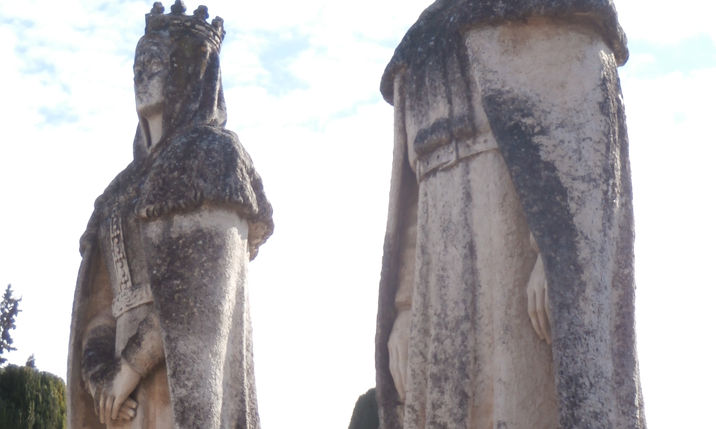
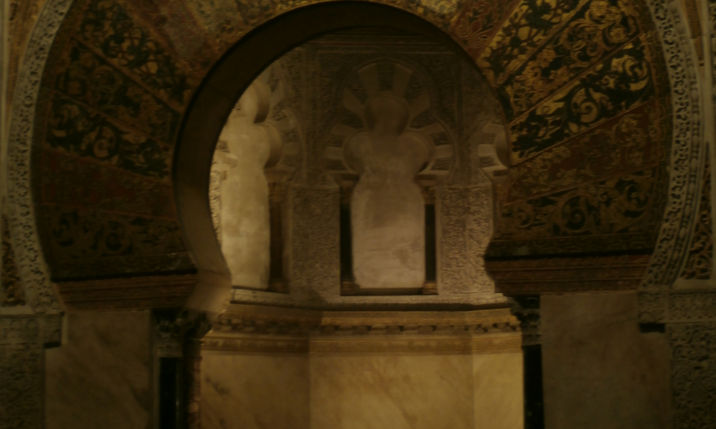
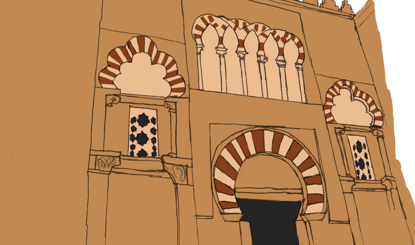
The main idea for this film is for it to be lavish with Spanish visuals in accordance with its cultural evolution, which includes Roman, Moorish and Catholic Christian architecture and ornamentation.
Stylistically, the film shall be magnificent and mysterious as it depicts the Spain from a cultural standpoint. The appeal of Spain is the thrill of its drama and layers of history, so visual presentation will be important.
Because the aim is to express my inner self, which is my fascination for Spain, the film shall use some dramatic lighting and shadow for that enigma.

Flamenco dancer photographed performing in Seville, Spain

Drawing one frame after another to animate a Flamenco dance would have taken up too much of the time it takes to finish this project. But fortunately Omid mentioned that actually animating a 2D character with something like Toon Boom wasn't absolutely necessary. Independent animators don't exactly follow the traditional approach expected from mainstream companies, as we have seen in 'A for Autism.' Here it was decided that the photos taken by myself of a Flamenco dancer in Seville could all be used to build a character animation. First these photos were printed and traced over, then the tracings were scanned onto the computer. On Photoshop, the linings were painted over with black so they would become silhouettes. But the silhouettes needed to stand out from the background.

A way to make the silhouettes truly pop out was to use some bright, bold highlighting. I just had to decide where the light was coming from and paint it across the edge of the figure.
No one knows what the dancer looks like because her face is hidden but for the outline of her nose. In the end, these frames resemble rotoscoped drawings from animated projects by Ralph Bakshi. In his films, characters are 2D animated over existing footage, but some of them are saturated in a certain colour (bold red or neon colours) contrasting with black for shading. Bakshi took a few liberties with the characters' features, putting horns on Nazi helmets, scary ghost faces on fighter pilots and pupilless eyes on African Zulu warriors.
This video is not the final project, but a practice run on how the animation would be executed. On Adobe Premiere, the photos were edited together to give the illusion of an actual Flamenco dance. The transition between arm gestures and footwork had to look convincing, so frames were chosen accordingly.
Originally, classical Spanish music like Joaquin Rodrigo's 'Concierto de Aranjuez Pt 1.' This track is uplifting with its violins and strumming guitar strings and at the climax, it grows more magnificent and fast-paced. That track is also one of the most iconic Spanish classical pieces, so it may have lent some authenticity to the film.
Another option was 'Choros No1' by Villa-Lobos with its relaxing, indolent strings. It might have possibly expressed the beauty and the aura of enigma surrounding Spanish history.
For even faster-paced music, 'Arrinconamela' by Gritos de Guerra would have accompanied the dance more fluently. It has tapping, guitar strings and hollering you would expect for a Spanish/Hispanic piece.
But in the end, Rodrigo, Villa-Lobos and Gritos d Guerra didn't feel quite so ideal. Of course 'Concierto de Aranjuez' does have some fast-paced parts, but they are spread out across a track that cuts between those and some quiet, slow parts. The slower, relaxing parts would have to be cut out with the faster parts mashed together. There would have been the danger of the music becoming choppy.
'Choros No1' didn't have the desired pacing nor that sense of turbulence I hoped for. Furthermore, 'Arrinconamela' sounded too much like Latin American Mariachi. Mariachi relates all the way to Latina culture and the Tango, so it doesn't reflect European Spanish history very well.
Instead, the music chosen was 'Plaza of Execution,' the opening music for the action movie 'The Mask of Zorro.' This track uses Flamenco-style tapping and orchestrations that bring intensity and an epic atmosphere. The panpipe music accompanies the tapping very rapidly, leaving no time to breathe. This is an example of the type of intensity I had hoped for. When the music halts, it does so abruptly and loudly, holding off until picking up the pace. So as it turns out, film score does better than classical music at carrying the point wish to get across.
Erica Russell's 'Triangle'
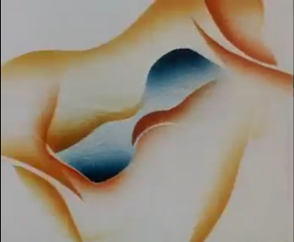
‘Triangle’ by Erica Russell portrays a heavily erotic dance. It follows characters that alternate between abstracted shapes and figurative forms.
Early in the short, a naked man and woman gracefully dance around each other as though performing a mating ritual, until an upside-down triangle, which turns out to be a black-cloaked woman, interrupts everything. It flits around the male with no sense of physical form, almost like an apparition or spirit. In a close-up, woman’s red face appears in the blackness and opens up to reveal a nude body before it wraps up the male like a fly-trap.
The females are contrasted by the first being pearly white of form, dancing elegantly whilst the second appears from out of black shadow before revealing a dark red body that possessively dances around the male.
Left outside and without her mate, the first female finds the black triangle that took him away and raises a red line seemingly in defence as though it were a quarterstaff.
Russell’s story takes a pivotal turn when the woman jumps down the triangle into this sheer drop not unlike the rabbit hole in ‘Alice in Wonderland.’ It is unclear if Russell intended this connection, but Lewis Carroll’s classic story used surrealism that traditionally comes packaged with a ‘nonsense’ story. She uses shapes and colours to tell the story, so the surrealism comes from the dark, untamed themes.
Having used a triangle as the trap to catch the male, Russell uses a red square in a black space to establish a sense of placement. The surrounding blackness starts to feel like a yawning tunnel leading up to this square that could be the door to somewhere.
Morphing from this square to all sorts of bizarre symbols like a pair of knots, a fork or candelabra, an arrow, even a vulva, the red female from before seems to entrap the rival woman in her own sinuous form. This melding of black lining and fiery yellow tendrils winds around like a pair of fish flapping their tails about.
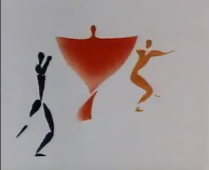
In the middle of the short, lining shaped into the male figure pulls the yellow female shape and the red female apart until they both assume solid forms and the same reddish-orange hue. With the statuesque male standing between these two matching females, all three characters stand on each tip of a red triangle. Russell seems to be using a literal representation of the metaphor that is a ‘love triangle.’
One woman coloured orange with curling tresses is represented dramatically puts her fingers to her lips. The other with her mouth open and a red streak painted over her face seems ready to challenge the orange woman over the male’s attention. The other one looks quite angry and/or indignant.
As he is pulled on both ends in a sort of ‘tug of war’ between the women, the male finds himself hanging by his wrists on a circular framing. The shadow cast by his body spins into a quarterstaff that he uses to push both female forms out of himself. Instead of starting another fight over him, the two women embrace him together until all three form into tessellating shapes that also shift into shapes that remind us of bodies pressing into one another during sexual intercourse. Over the course of this new dance, there is harmony between all three characters, the man at the centre of the threesome marked out by a cooling dark blue contrasting against the warm reds of the two women.
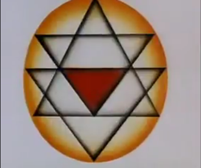
Next the two women form dresses, not unlike the sort worn for Flamenco dance. Only the man appears naked, dancing around these elegantly dressed female figures. Lastly, the red woman that came between the couple begins to shapeshift back into an almost phantom-like form except she stays red whereas last time her form was a shadowy black. This time she spins between the man and the yellow woman whose lusty relationship she had disrupted as they dance around her. Lastly focus is on the red shape flitting and rotating hypnotically until black lines appear shaping into what looks like the star of David, if it had more points.
Triangle’ is quite heavy on the erotic tones, from the intimacy between the male and two female figures up to abstract shapes that resemble sexual intercourse and a vulva. This type of imagery shares the painterly style and palette of cave drawings from ancient times. The figurative drawings take form akin to rough brushstrokes with graphic display of sexual anatomy. To get the point across, the male’s body is quite athletic whilst the females are lean and sensual, which justifies the primeval, dark designs.
One artist these designs can be compared to is Pablo Picasso’s ‘Les Demoiselles d’Avignon,’ a rather sexually direct cubist painting of nude prostitutes. Picasso used rather strong pinks, reds and bronzed pigments for the skin tones whilst building their forms from primitivism and sharp-edged shapes. He interpreted the prostitutes peering at the onlooker with the sort of lust that threatens aggression, the way African masks use cubism and simple structures to achieve their alien appearance. Similarly, Erica Russell alternates between the wispy bodily structures and boldly-coloured lines. She possibly even shares Picasso’s African influence with the woman’s face painted with the red lightning-bolt streak down the side of her face. Picasso and Russell seem to strip sexual themes to their barest, most base concepts.
The message in 'Triangle' addresses different human conditions. One includes feelings of guilt the male feels as the two mates fight him, hence feeling as though he is stuck in that circular cage. That Islamic-like holler when the first female is stuck without her mate implies just how betrayed she feels, which underlines the abandonment a love triangle can bring about.
The music varies from drumming along the lines of the African tribal type and graceful Spanish guitar. Drumming suits the primitive vibes of the caveman-like painting style and the ominousness of the untamed sexual energy.
The Spanish guitar accompanies the opening dance, the intertwining between the two female figures and the final scene where they dance in dresses. It flows rather similarly to the tango, which rose through a combination of Hispanic, African, Native American and Eastern European influence and is commonly interpreted as a romantic dance. Again the African-influenced art style complements the tango-like music choice.
As the first female figure is left without her mate and the spiritual female is about to appear, there is hollering of the type you hear in Spanish Flamenco. This comes from the Islamic influence on Spanish culture, particularly when the Moors had power in the Iberian Peninsula. Russell may have strategically placed the vocalising to underline the stress of separation the female feels after her loss. As the male figure struggles against the cylindrical lines he is hanging onto, there is rapid heavy breathing accompanying the drumbeats. We can imagine the male breathing as he struggles against his sense of entrapment caused by the two females clashing over his attention.
As far as inspiration, Erica Russell’s ‘Triangle’ is certainly informative. There certainly are parallels between ‘Triangle’ and my project. Although the woman dancing in my film is outlined as a silhouette, she is highlighted by saturated golden yellow. The women dancing in ‘Triangle’ are coloured in red and yellowish orange. Whilst Russell animates her figures either outlined in a particular colour or coloured entirely, I have coloured my flamenco dancer black contrasting with lighting along the edges to make her look more 3-dimensional. My project also uses intense Spanish music the way Russell accompanied ‘Triangle’s’ dance scenes with guitar music. The difference is that I am using James Horner’s ‘The Mask of Zorro’ score to complement Spain’s historical roots. Russell used flamenco/tango music and African drumming to convey sexual attraction. Sexual themes aren’t exactly a priority because this project covers Spanish history. The silhouetted dancer serves as a sort of representation of Spain ‘dancing’ through the turbulent transitions between Roman, Moorish and Catholic cultures. Still, the dancer looks slender and mysterious, so she can be interpreted as sexually enticing although we only see her figure.
Although ‘Triangle’ makes for effective research, I still intend to pursue my own independent direction with this Spanish-inspired project. Any other time I would be glad to 2D animate a character as a whole, but animating for a minute or more is quite a painstaking process. Using and reusing traces from photos is, for me, a unique way to exhibit what other ways I could execute an animated project. Also I have little interest in utilising the cubist, abstracted style of cave drawings and Picasso, though I still appreciate them on an Art history level. The style I intend to pursue is a painterly detailed style with strong lining and lavish designs. However I aim to use the colour palette to do justice to the cultures that surround Spanish history like the sandy beiges, reddish brown and golden yellows. What’s more I don’t exactly intend to make my film sexually explicit. The dancer can look seductive, but she is meant to visually convey the magnificence and danger Spain possesses. She should draw you in because she looks so attractive and dramatic, but her shadowy appearance also make you wonder if she is more than what she seems.
Sketches and colour trials

Further developments of the idea for the film include a woman flamenco dancing to a transition from Roman Spain, to Moorish mosques to Christian Catholic castles and cathedrals. Patterns, architecture and effects like candles would represent each culture. The sunburst stained-glass window could spin behind the woman as she does her flamenco dance. Buildings and statues could rise out of the ground behind her, symbolising the fall of an old culture and the rise of a new era. How this unfolds could be arranged in a storyboard or animatic.


