When challenged to adapt an existing text into an an animatic, my ambition was to choose a superhero comic in a similar manner to the DC animated series and movies from Warner Brothers. The decision was to focus on a female superhero in the wake of the success of 'Wonder Woman' last year, using female empowerment and gender equality for the sake of relevance.
The question was whether to choose Wonder Woman or bring another heroine to the fore. Batgirl had a rather successful series from 2014 by writers Cameron Stewart and Brenden Fletcher illustrated by Babs Tarr. On the other hand, Wonder Woman had a successful run by Brian Azzarello (writer of '100 Bullets') illustrated by Cliff Chiang.
Wonder Woman: Blood. Azzarello, B. 2011. DC Comics
Batgirl of Burnside. Stewart, C. Fletcher, B. Tarr, B. 2014. DC Comics


If I was going to choose a superheroine, I would choose Brian Azzarello's bloody, sensual but modern Wonder Woman run or Stewart, Fletcher and Tarr's breezy, millennial and energetic Batgirl run. Either would be approached with a modernist flavour, with the superheroic conventions intact and a consistent linear narrative, but with a female character at the helm and a more urban 21st century background.


How to draw great-looking comic book women. 2000. Hart, C. Watson-Guptill Publications, NYC
Sketches of Batgirl and Wonder Woman were made. Batgirl would not be as serious, being a more hip, rad young woman with a sense of style along with having Batman's training. She would also have more female sidekicks like Bluebird and Black Canary, which could emphasise female empowerment further.
Wonder Woman would have more gravitas, showing deep compassion for those she would protect with a fearsome fighting style. There is emphasis on Wonder Woman's athletic figure and feminine beauty, but it can be argued that her leotard evokes the Ancient Greek appreciation of the youthful human form and women in the Olympics, particularly Jessica Ennis Hill.
Cliff Chiang or Babs Tarrs' efficient and striking designs could be integrated into my clear, rounded style.
My style could be likened to Bruce Timm, whose old-school comic style gave rise to 'Batman the Animated series' and 'Justice League' from 1992 to the mid-2000s.
Epic storytelling has become my forte, so a clear, striking design and animation style could hook audiences to the action and the characters. It could even be used to go a dark, adult or a carefree adventurous route.
Eventually after some spider diagrams and more sketching, fellow animation students were consulted for votes between Batgirl or Wonder Woman. Wonder Woman won out in the end.
Synopsis
This animatic is a combination of superheroes and Greek mythology through a female protagonist.
A young woman named Zola is being targeted by the sun god, Apollo for the birth of a child that resulted from an affair with the thunder god Zeus. When she is attacked by two assassins and Apollo’s sister Artemis, Wonder Woman steps in to put a stop to this petty homicide with the aid of her stone-skinned brother Lennox. As a battle for Olympian justice breaks out, the Amazon princess’s fight to protect a fellow child of Zeus courts the eyes of the ancient gods
The format of the animation shall be a Quicktime video played on my Wix account.

Treatment
The animation shall be a comic-book-style in the manner of superhero cartoons, particularly those produced by Bruce Timm and DC Comics, like ‘Justice League’ from 2001. Furthermore, it is inspired by the ‘Wonder Woman’ comics run by Brian Azzarello and illustrated by Cliff Chiang. Azzarello’s stories are quite dark and bloody while Cliff Chiang uses a smooth efficient style suited for epic storytelling.
My drawing style uses bold lining like Timm and Chiang’s, except it has more curves, circles and circles like a sort of armature. First the circles are drawn in pencil, then the anatomy is drawn with ink pen before the details are applied. This realistic drawing style can be justified as a way to properly convey a superhero story with the right amount of dynamic compositions and intense action.
The animation is action-packed with a female character and her brother fighting for the life of another woman and her baby son.
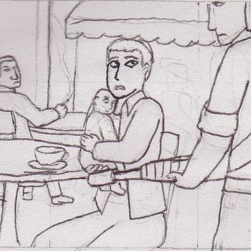
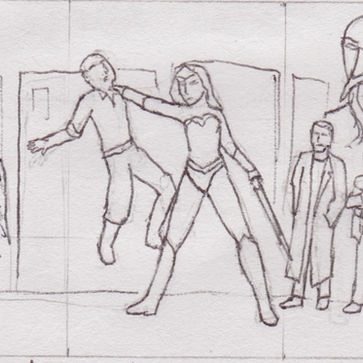
Structurally, the short starts off with a calm café scene in the city, grows suspenseful as two men try to assassinate the young woman and her baby. It then shapes into a tense standoff between the Artemis, the goddess of hunting against the main heroine and her brother who reveals himself from the crowd. The fight scene starts off explosively, reaching an intense moment when the young woman and her baby are nearly killed and Artemis gets the upper hand over Wonder Woman. When the brother shields the mother and her baby by using his stone skin from the thug’s guns and Wonder Woman beats up Artemis, the story ends on a positive note, the action slowing to a halt before dying down. But at the very end while the protagonists are victorious, we find the Greek gods, including Apollo, Hera (Zeus’s former wife) and Ares (War) watching all this. Therefore the short ends on an ominous note that Wonder Woman’s adventures are not yet over.


Wonder Woman's brother an ally

Two of Apollo's minions who accompany Artemis to assassinate Zola and her baby whom Zeus conceived through an affair

Apollo's sister, goddess of the moon and hunting sent by her brother to assassinate Zola and Zeus's bastard infant

The main antagonist of the animatic, the tyrannical god of the sun and music
My expertise in drawing has lent itself well to 2D animation. When drawing, my aim is to be efficient, to the point and carry out a range of action and emotions. This should make it flexible enough for animation.
What’s more, I have some experience with Adobe Premiere and After Effects, which should help in editing the animation into a coherent story and syncing the audio.
My intention with this ‘Wonder Woman’, animatic is to portray a heroic female character at the head of the story. Hopefully it not only entertains male and female audiences, but also empowers female audiences, which has always been Wonder Woman’s main purpose. To keep female empowerment intact, the male protagonist from Azzarello’s comics run who was Wonder Woman’s brother is being used as her ally. This way male watchers can be cut in on the story and gender equality is preserved.
Storyboard


Animatic -old version
Animatic - revised version
Redundant parts or ones that could be dropped without fuss were removed to condense the animatic to a minute and a half.
Wonder Woman was voiced by
Artemis was voiced by
Wonder Woman's brother Lennox was voiced by myself. Eventually it became apparent that to produce a minute and half animation, dialogue should be cut. Fortunately the grunts and yells the drama students made during the fight could be kept. If the film had vocals, it would make the fight between the characters believable.
Stock sound effects were downloaded from with Realplayer Downloader, then mixed into Adobe Premier. These sound effects were chosen depending on the impact they could make audio-wise.
Realplayer Converter made these videos Mp3 files that could be mixed into Premier. Admittedly this method was quite crude and rough and ready.
Production
With the animatic on hand, it was time to start fully animating Wonder Woman fighting evil.
Animating on Photoshop was the chosen method, because of prior experience drawing, colouring and playing about with the timeline when creating the animatic.
One downside of Photoshop was that audio in its timeline lacked the ability to show every beat and volume like how Toon Boom and Premiere do. It made it difficult to place drawings exactly where sound effects were. Solving this mainly involved playback. Another issue was that playback suffered a fair amount of lag, possibly because of the vast amount of memory the Photoshop file held.

Panel from Wonder Woman showing the character in detailed form.
Azzarello, B. Chiang, C (2013) Wonder Woman Volume 3: Iron. DC Comics, 1700 Broadway, New York, NY 10019. Issue 15

This turnaround presents a summary of how Wonder Woman would be portrayed. Whilst holding onto Cliff Chiang's take on the classic character design for inspiration, the boots were switched to more practical soles rather than heels. Characters wearing high-heeled footwear would be hard to animate now, so that had best be saved for another time. Fortunately the software had ways to make some realistic effects. Gradient really brought out the metallic surfaces of Wonder Woman's bracelets and tiara and could convince people that her outfit acts as a form of armour. For time limit's sake, the intricate patterns along the red bodice and the white stripes on the front of her boots were left out. Animating in 2D involves a lot of drawing. Digital animation has no such trouble with intricate detail in comparison.
Wonder Woman stands out in an urban setting with her elegance and colourful costume, but the decision was made not to make things wacky nor cartoonish. The action would be fast, sharp and powerful, reflected by sound effects and intense movement. Whilst staying true to the modern day comics, the animation would not reflect the breezy Adam West Batman, but the impactful, adrenaline filled battle scenes from 'Timmverse' (Bruce Timm) Batman/Justice league animation.
A way to counter the slow process of putting in drawings one after the other was to look back at the animatic and place layers in the timeline depending on the scene. So the trick was to start of drawing the beginning and end poses, then dragging the cursor between the two drawings.


Once the beginning and end poses were marked, the layers could be trimmed in the timeline to make way for more frames to be added, giving flow to the animation.
Williams, R. Sutton, I (2001) The Animators Survival Kit. (4th) Faber and Faber Ltd, 3 Queen Square, London WC1N 3AU
The Dope sheet was a classic technique learned from 'Animators Survival Kit.' According to Williams, R. (2001), this sheet can "put any beginner or artist off the whole business," but it turns out to be "awfully simple when you make friends with it."
In truth it was particularly helpful when animating Wonder Woman fighting Artemis in the sword duel. Dragging the playhead to where sound effects and vocals started were jotted in the sound column and an arrow was drawn depending on how many frames the sound lasted. A Photoshop layer could be trimmed from one second where the sound started to the second where it finished, so syncing choreography with sound was more efficient.


It was decided that the film should be made into a mock-movie trailer. Trailers can be clips chopped together to give audiences a preview of what they expect from something featuring a superhero/heroic female character or an action story. A trailer would create less workload and meet a more plausible brief.
For music, the soundtrack for the Wonder Woman movie was invested, because the use of a familiar theme would not only be appropriate for the trailer, but compliment the suspense and action pretty well.
A good amount of young women look up to Wonder Woman as a representation of female strength. With any luck this animated film is thrilling enough to impress comic book enthusiasts male and female. Meeting the deadline might probably involve only coming up with some of the bare bones of the animation, such as poses without inbetweens or uncoloured, but at least it might show what techniques have been learned about traditional animation. Perhaps if this is tried again, there might be more understanding of the production process that can lead to greater projects.

